Harbour Air
Website Revamp
UX RedesignInformation ArchitectureBooking FlowFigma
"A complete redesign of North America's largest seaplane airline website - fixing broken information architecture, simplifying online booking, and creating a premium digital experience worthy of a 40-year iconic brand."
01Overview
Client
Harbour Air Seaplanes - North America's largest seaplane airline. Founded 1982, Richmond BC, Canada. 15 scheduled destinations across coastal British Columbia and Seattle.
Project Type
Full website UI/UX revamp - Information Architecture + Visual Design + Booking Flow redesign
Scope
Homepage · Scheduled flights · Tours & experiences · Destinations · Booking flow · Flight info · Fares · About
Outcome
Client was delighted with the final result. Outdated, cluttered website transformed into a modern, conversion-focused experience.
End-to-end UI/UX - content audit, information architecture, wireframes, high-fidelity design, booking flow redesign, and final visual system. Every page, every flow, from a blank canvas to a signed-off, client-approved deliverable.
02Problem Statement
Harbour Air is an extraordinary product - a seaplane airline with 40+ years of history, 15 destinations, scenic tours, charter services, and a fleet of iconic floatplanes. But their website told none of that story well. It was outdated, visually inconsistent, and structurally overwhelming - burying the most important action (booking a flight) under layers of cluttered content.
- Outdated visual design out of sync with the brand's premium positioning
- Cluttered information architecture - massive content with no clear hierarchy
- Booking flow buried and confusing - too many steps, unclear fare types
- No clear distinction between scheduled flights, tours, and charter services
- Poor mobile experience - not optimised for on-the-go booking
- Inconsistent typography, spacing, and components across pages
- Destinations presented as an overwhelming flat list with no guidance
- Modern premium visual system matching Harbour Air's brand identity
- Clear IA - every page has one primary job and one clear CTA
- Streamlined booking flow - Route → Date → Passenger → Confirm
- Distinct sections for flights, tours, and charters - zero confusion
- Fully responsive, mobile-optimised layout throughout
- Consistent design system across all pages
- Destinations designed as an inspiring, browsable experience
03UX Laws Applied
Every design decision on this project was grounded in established UX laws - not personal preference. Here are the key principles that drove the redesign.
The old nav had too many options causing decision paralysis. We reduced primary nav items and grouped content logically - fewer choices, faster decisions, more bookings.
Reorganised 15 destinations into scannable groups. No page presents more than 5-7 primary choices at once - keeping users in their cognitive comfort zone.
"Book Now" CTA made large, high-contrast, and placed in the primary visual area on every key page. The most important action is always the easiest to click.
Users expect airline booking flows to work like Skyscanner or Expedia. We followed familiar patterns - origin/destination picker, date selector, passenger count - reducing the learning curve.
Related information (route + schedule + fare) grouped tightly together. Users scan and understand a flight option in seconds without hunting across the page.
Complex content (baggage policies, booking conditions, fare details) revealed progressively - summary first, details on demand. Reduces overwhelm without hiding information.
Every page designed with a clear visual hierarchy - headline → supporting info → CTA - placing key content where users naturally scan first.
A beautiful interface feels easier to use. Upgrading the visual design - premium photography, clean typography, consistent spacing - directly improved perceived usability and trust.
04Research
Research Methods
- Heuristic evaluation - audited the existing website against Nielsen's 10 usability heuristics to identify all UX violations
- Competitor analysis - studied Air Canada, WestJet, Alaska Airlines booking flows for best practices
- Content audit - catalogued all existing pages, identified redundancy, outdated content, and structural gaps
- User flow mapping - traced the full journey from homepage to booking confirmation to identify all friction points
- Information architecture restructure - reorganised the full content hierarchy before any visual design began
Key Findings
- The booking flow had unnecessary steps and unclear fare labels causing drop-off before payment
- Tours and scheduled flights were mixed together - users couldn't distinguish a sightseeing tour from a commuter flight
- Destinations page was a flat list with no context - users didn't know which route was right for them
- Homepage didn't establish trust or tell the brand story - a 40-year iconic airline felt invisible on its own website
- Mobile users had a significantly degraded experience on all booking pages
05User Personas
Four distinct user types with completely different mental models, motivations, and expectations - each requiring their own designed pathway through the site.
The Commuter
Business traveller flying Vancouver-Victoria regularly. Values speed, reliability, and effortless rebooking. No time for friction.
Needs: Fast route search, clear schedules, quick checkout, booking management.
The Tourist
First-time visitor to BC wanting a scenic experience. Doesn't know the routes. Needs inspiration, destination guidance, and a reassuring booking experience.
Needs: Inspiring destination pages, tour options explained clearly, trust signals.
The Experience Seeker
Local or visitor looking for a scenic tour or adventure package. Driven by visuals, not schedules. Wants to feel the experience before buying.
Needs: Beautiful tour pages, package details, duration and pricing upfront.
The Charter Client
Corporate or group traveller needing a custom charter. High-value client who needs confidence in the brand before reaching out.
Needs: Premium feel, charter enquiry flow, trust signals, clear contact path.
06Ideation
- Homepage as a conversion machine - hero with booking widget front and center. No scrolling required to start a booking.
- 3 clear pathways from homepage - Book a Flight · Explore Tours · Charter a Plane. Every user type immediately sees their path.
- Booking flow reduced to 4 steps - Route → Date & Passengers → Fare Selection → Payment. All unnecessary screens removed.
- Fare types simplified - Eco · Flex · Premium clearly explained with a side-by-side comparison table. No jargon, no confusion.
- Destinations as stories, not lists - each destination gets a hero image, key highlights, and a direct booking CTA.
- Tours as an experience catalogue - card grid with duration, price, and vivid photography. Filterable by type and duration.
- Trust signals throughout - 40+ years of safe flying, safety badges, customer reviews - critical for first-time seaplane users.
- Mobile-first booking - bottom sheet patterns for date and passenger selection on mobile, native-feeling interactions.
07Design
From wireframes to high-fidelity - every screen designed with a clear purpose and one primary CTA.
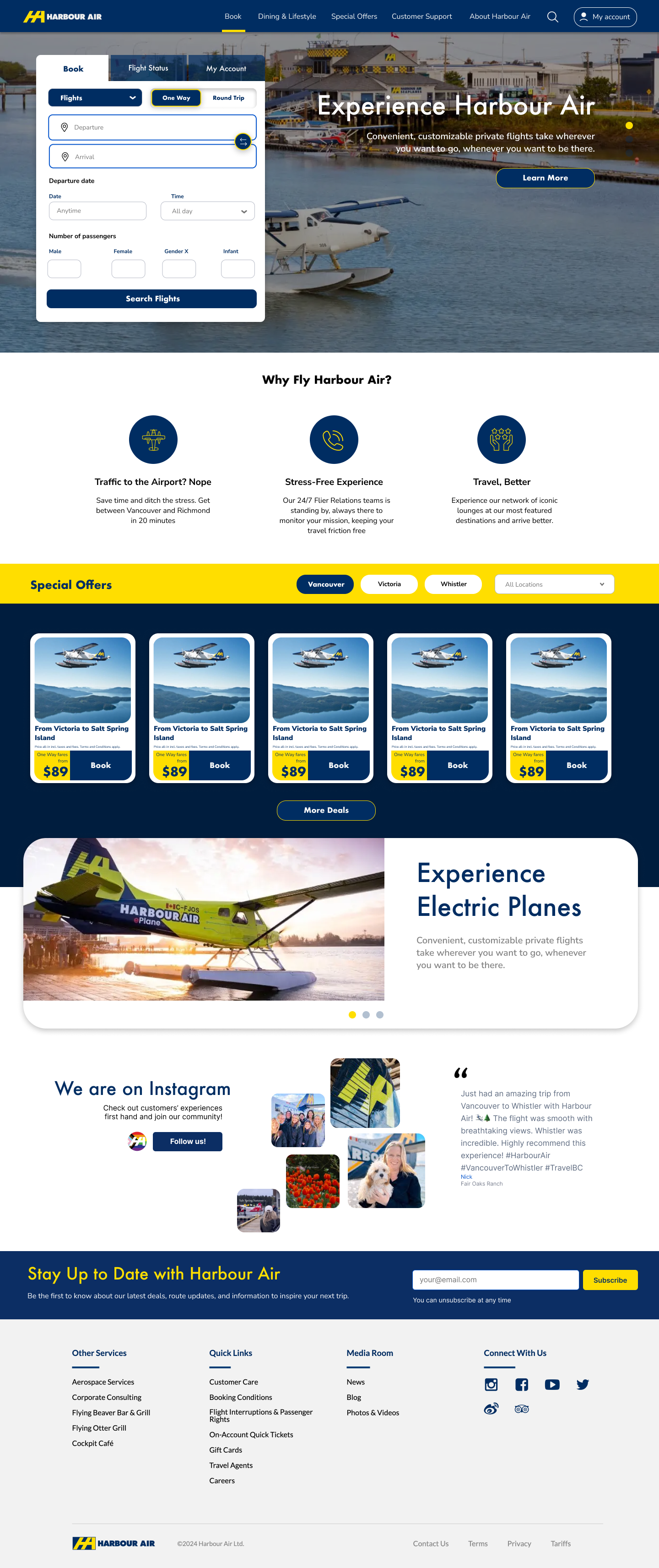
Homepage & Navigation
Homepage - Hero & Booking Widget
Navigation - Mega Menu & IA
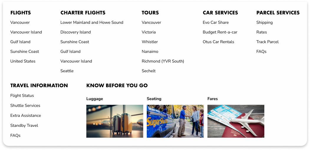
Destinations & Fares
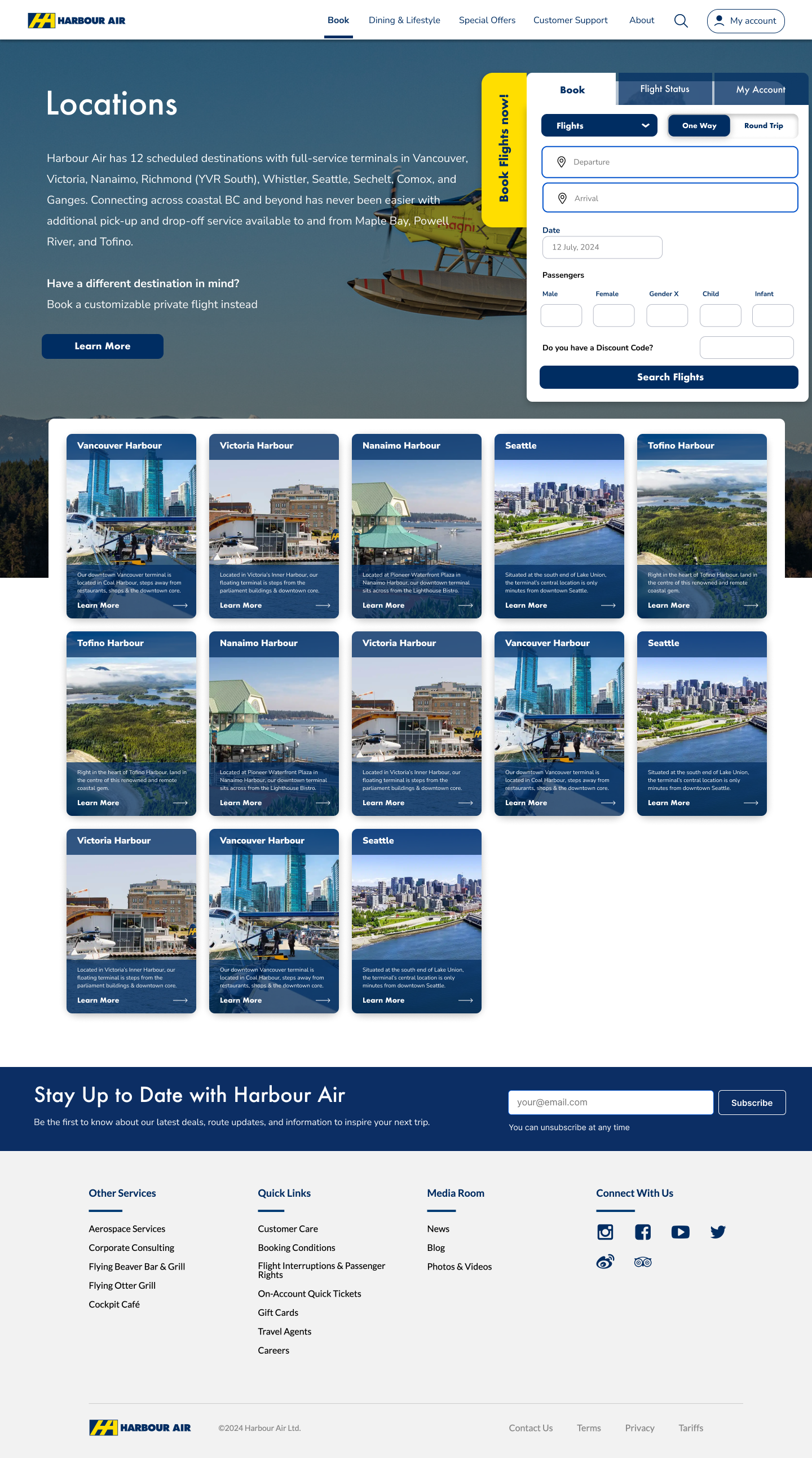
All 15 Destinations - Browsable Grid
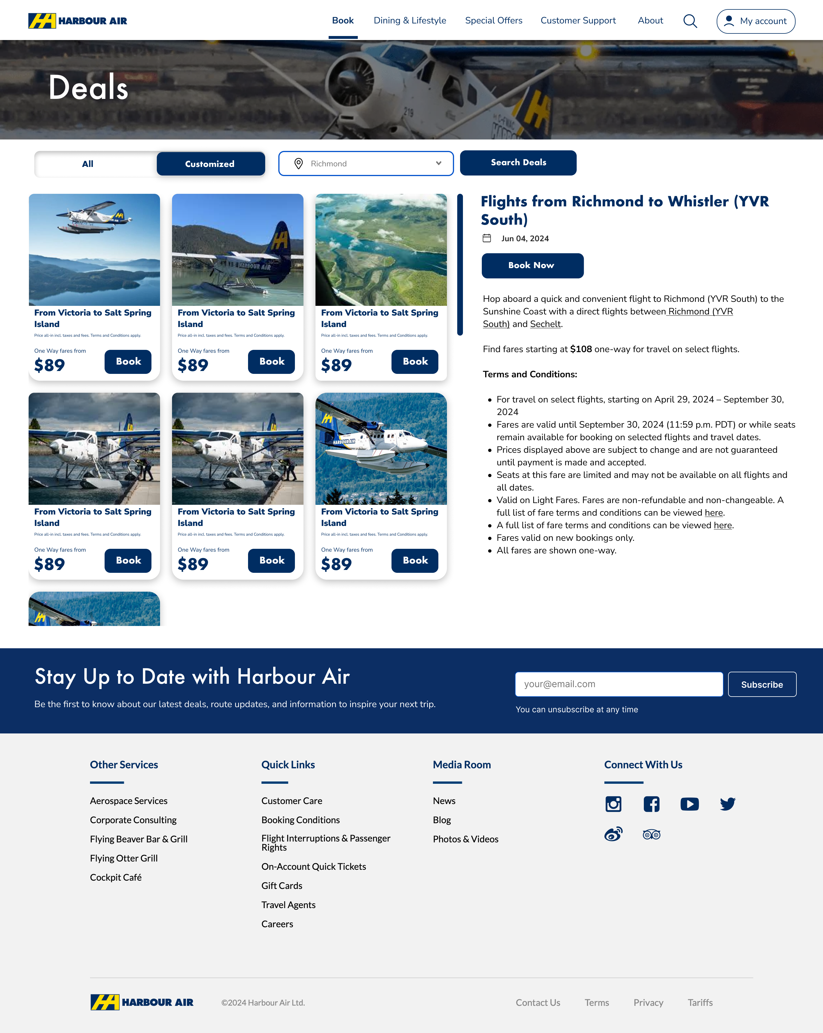
Deals - Fare Cards & Pricing
Tours & Experiences
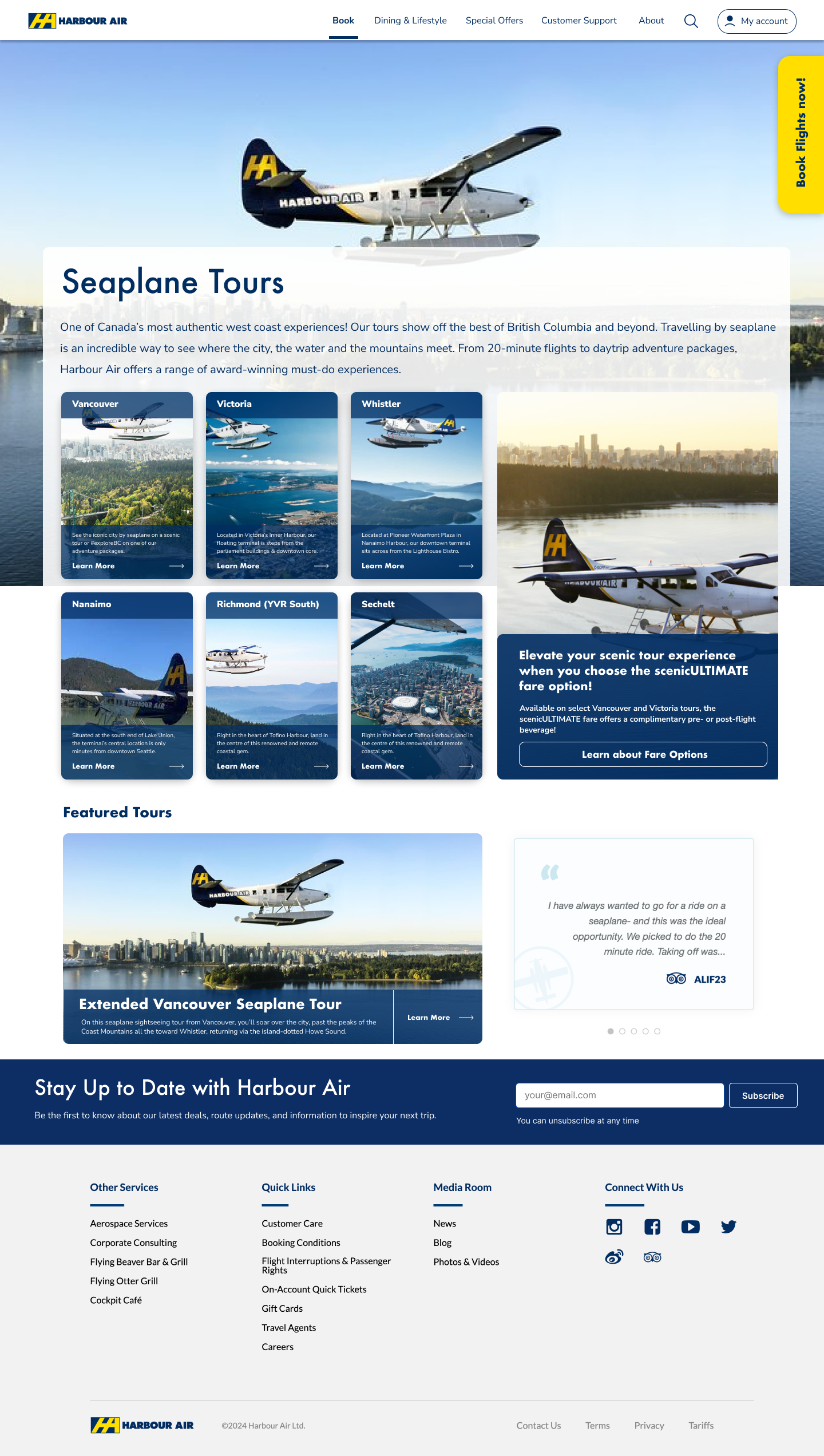
Tours Catalogue
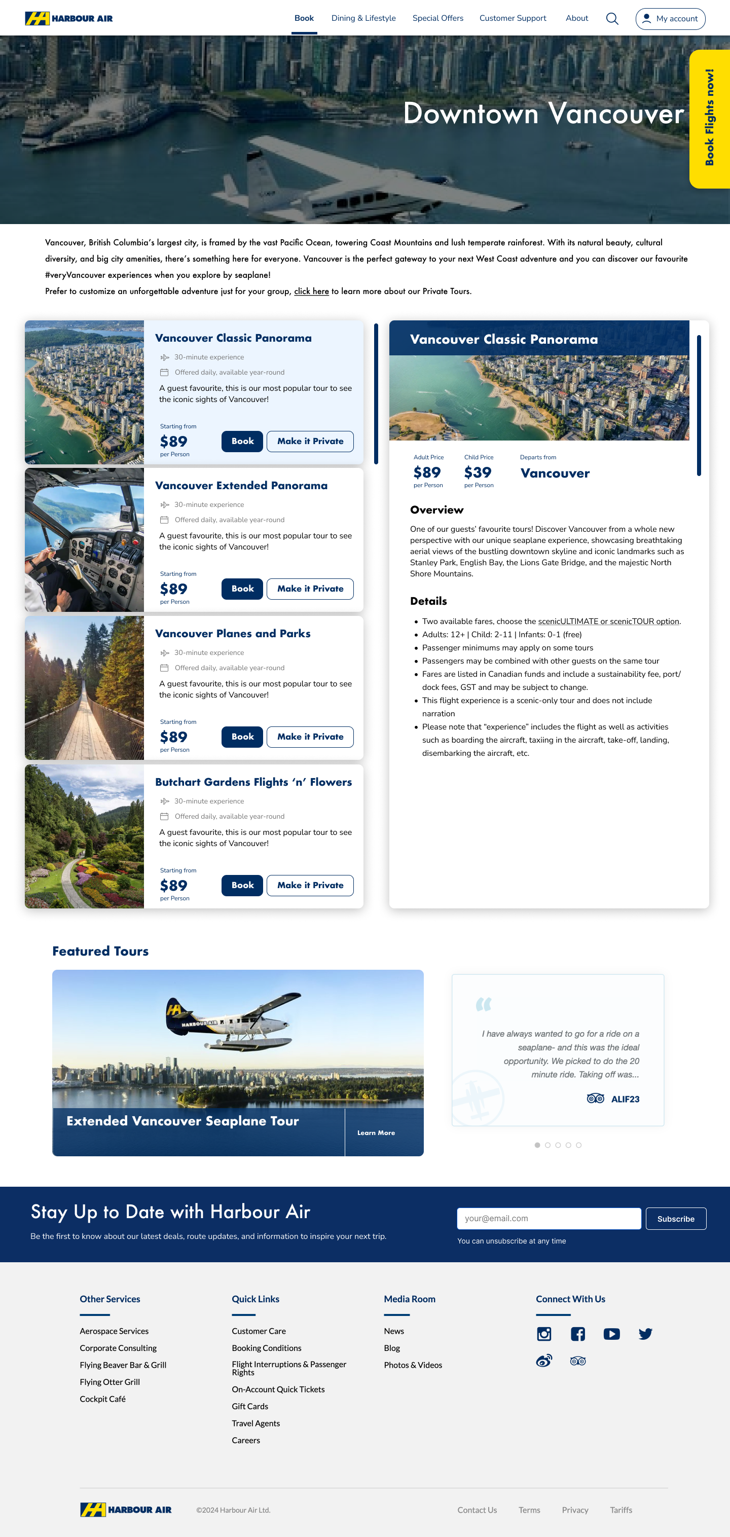
Tour Detail Page
Charter Flights
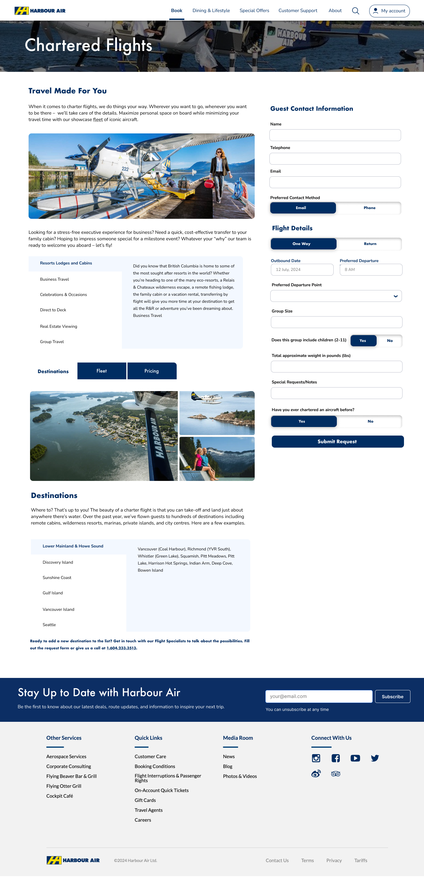
Charter Destinations
Charter Fleet
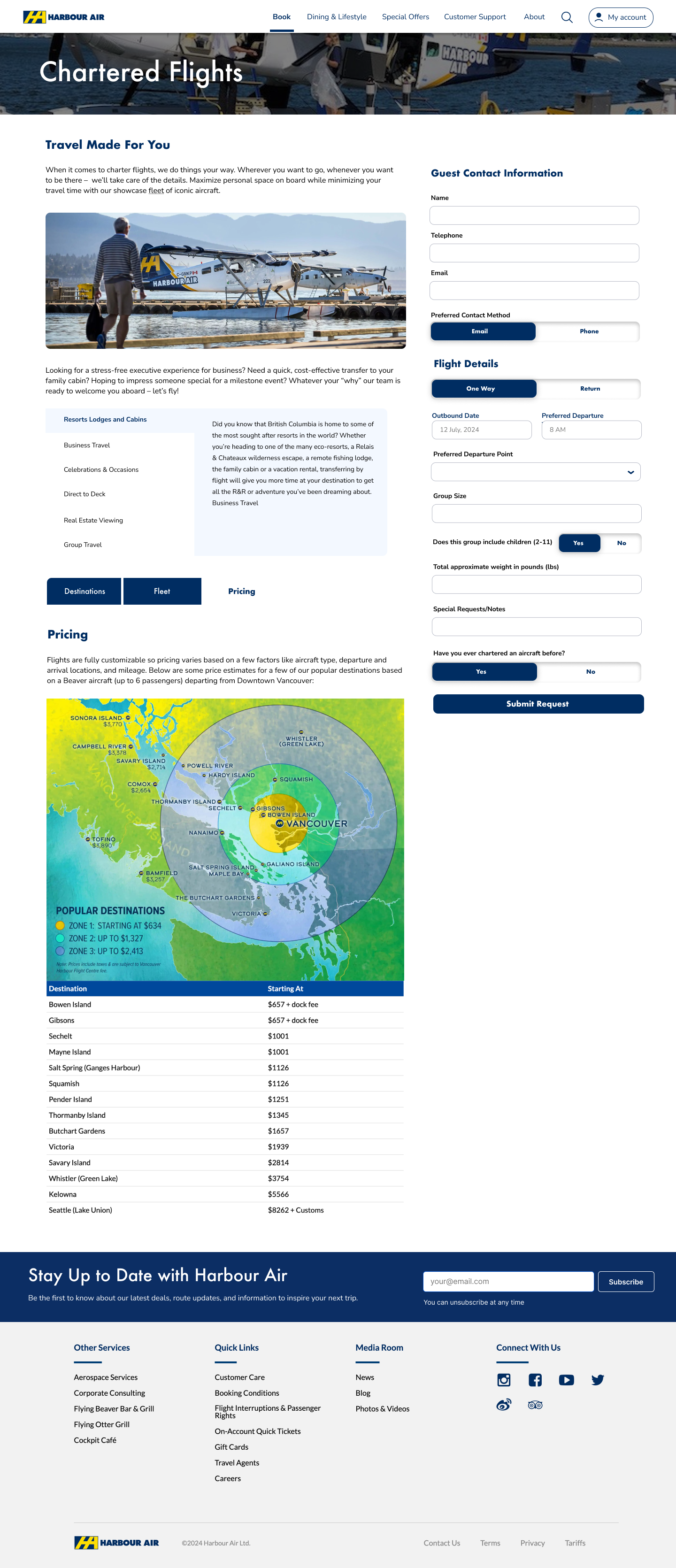
Pricing Map
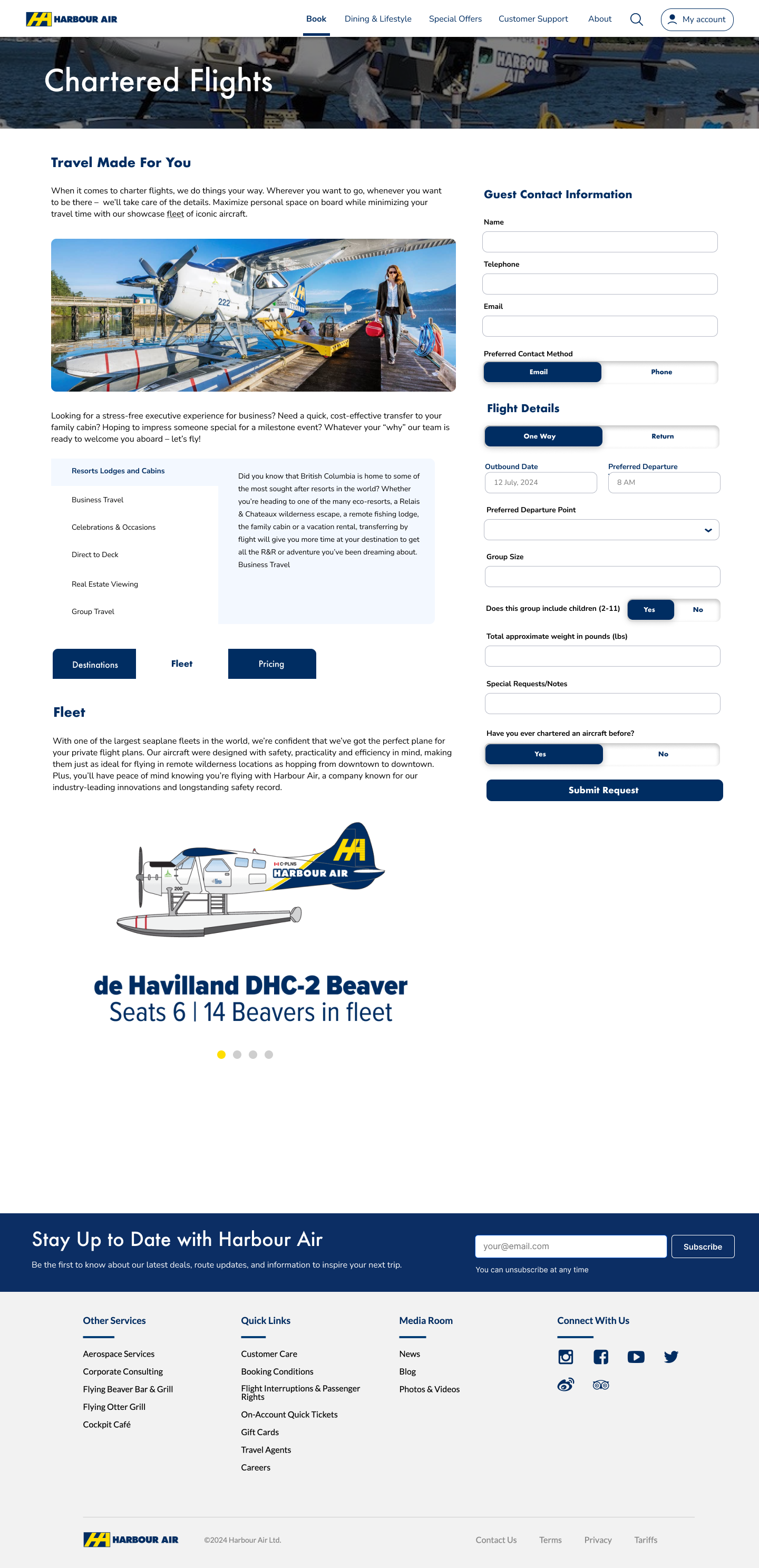
Fleet & Aircraft
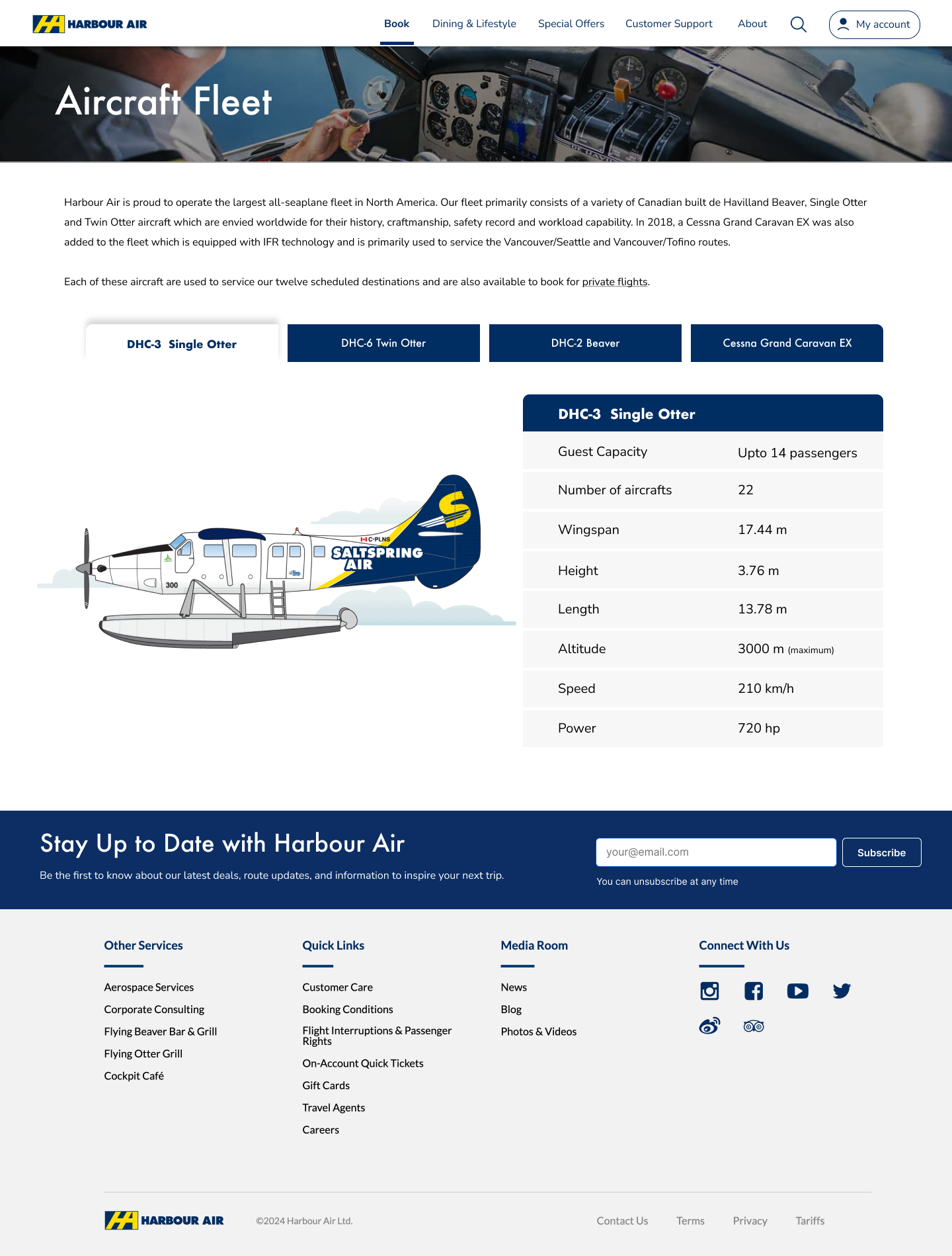
DHC-3 Single Otter
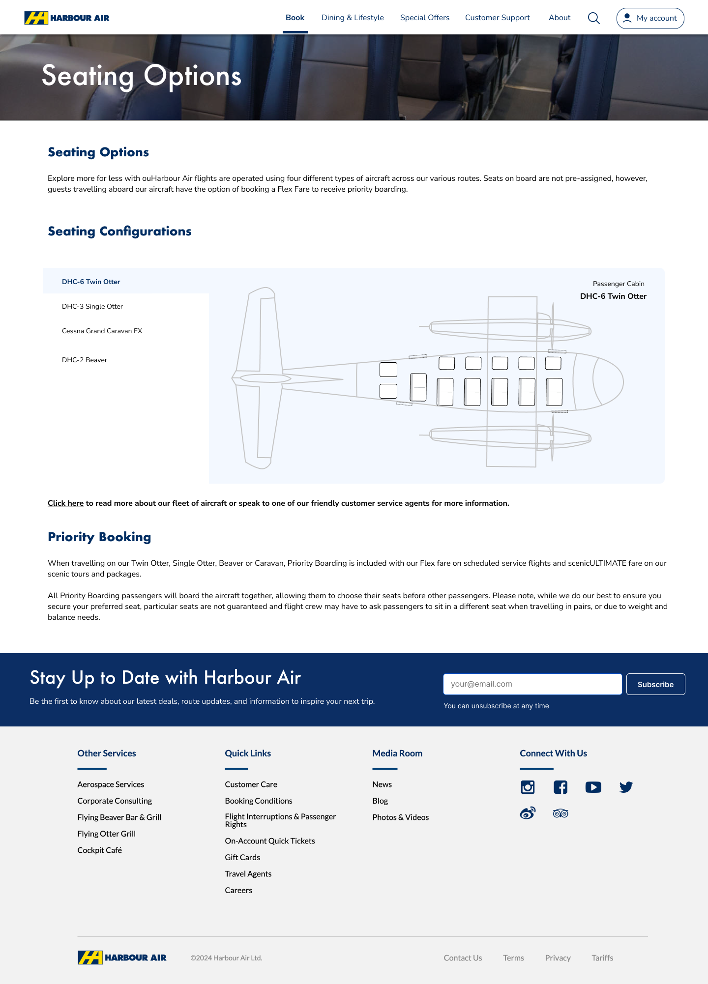
DHC-6 Seating Options
Bookings, Status & ePlane
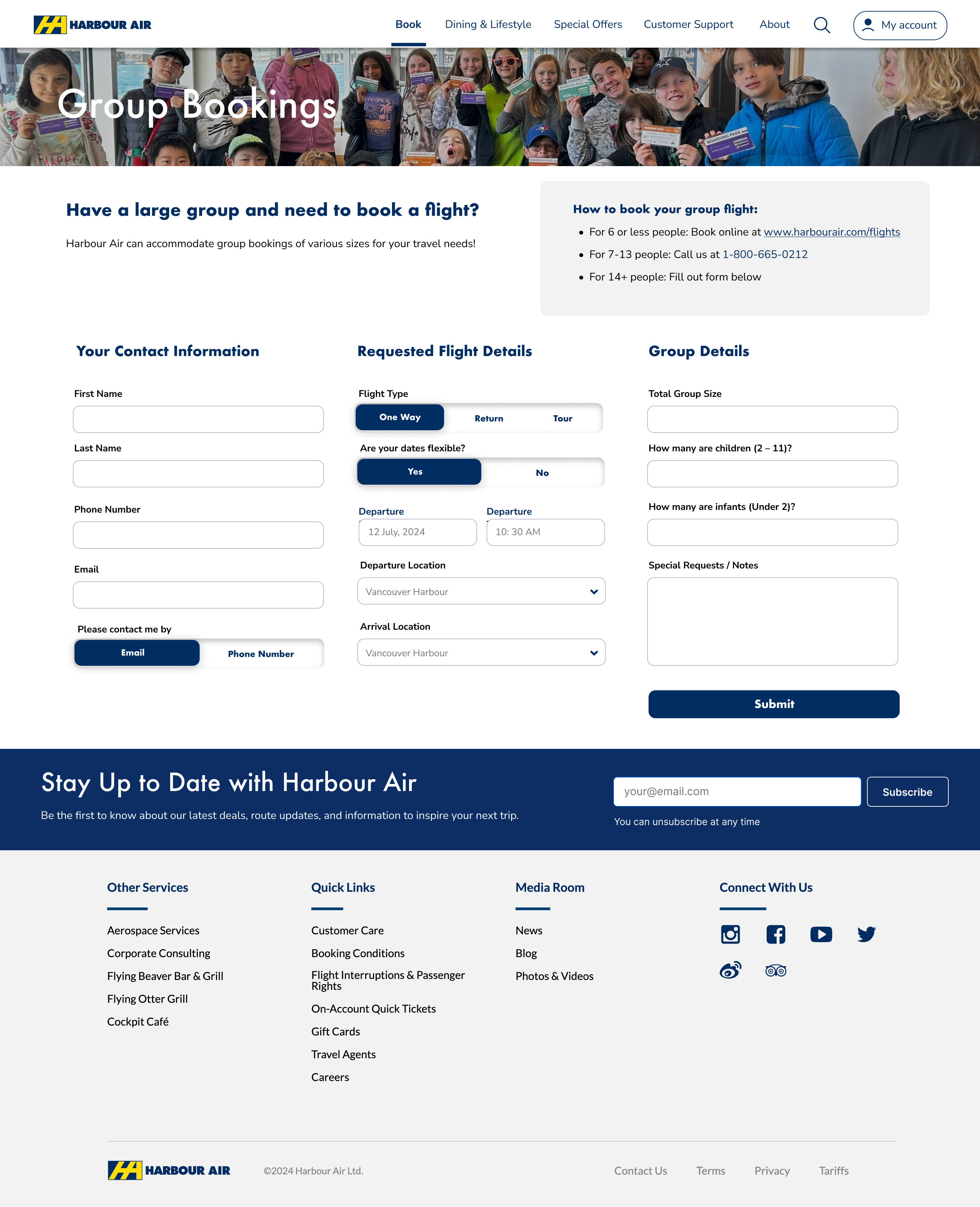
Group Bookings
Flight Status
ePlane - Going Electric
Support & Information Pages
Contact Us
FAQ
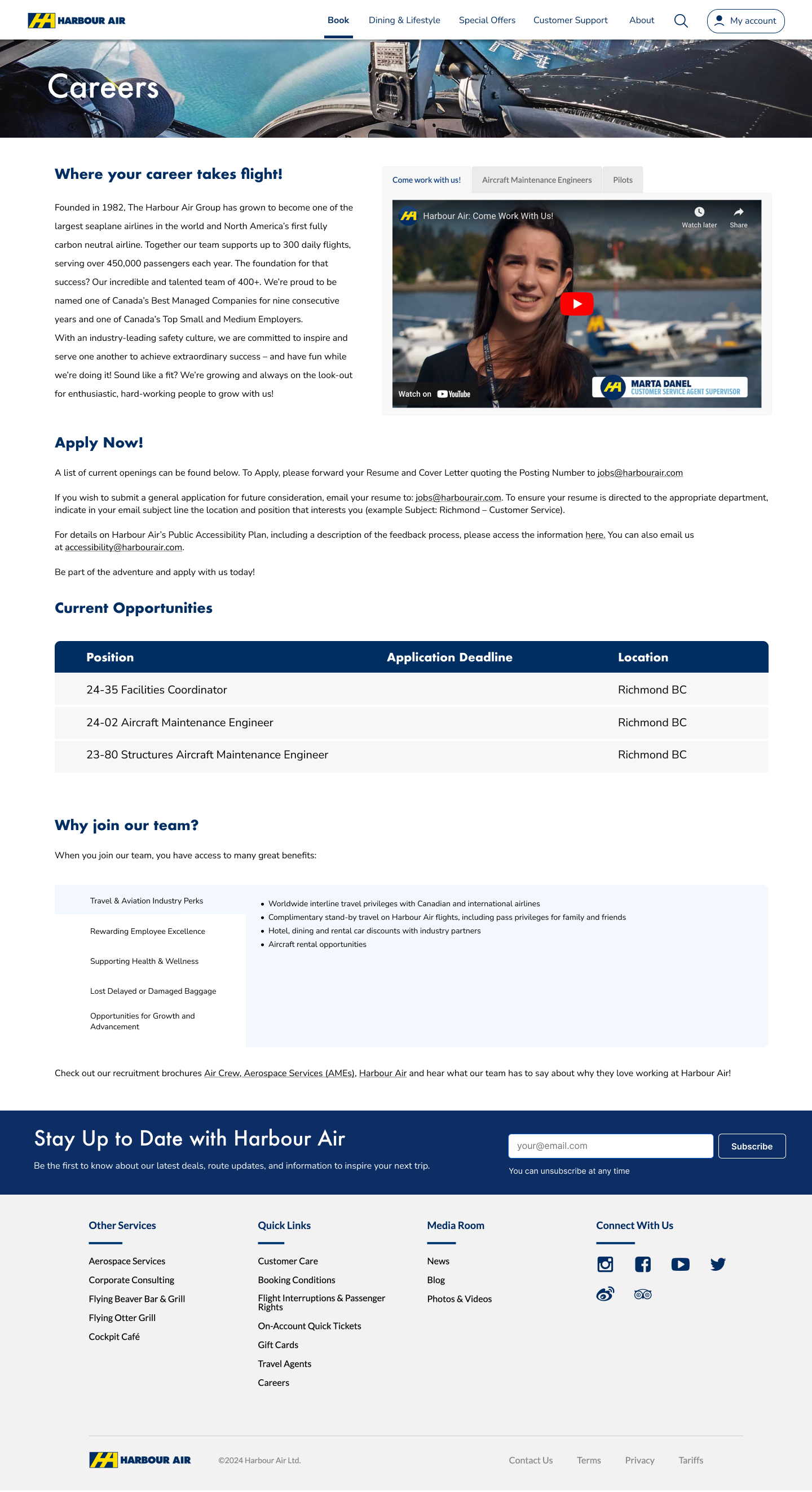
Careers
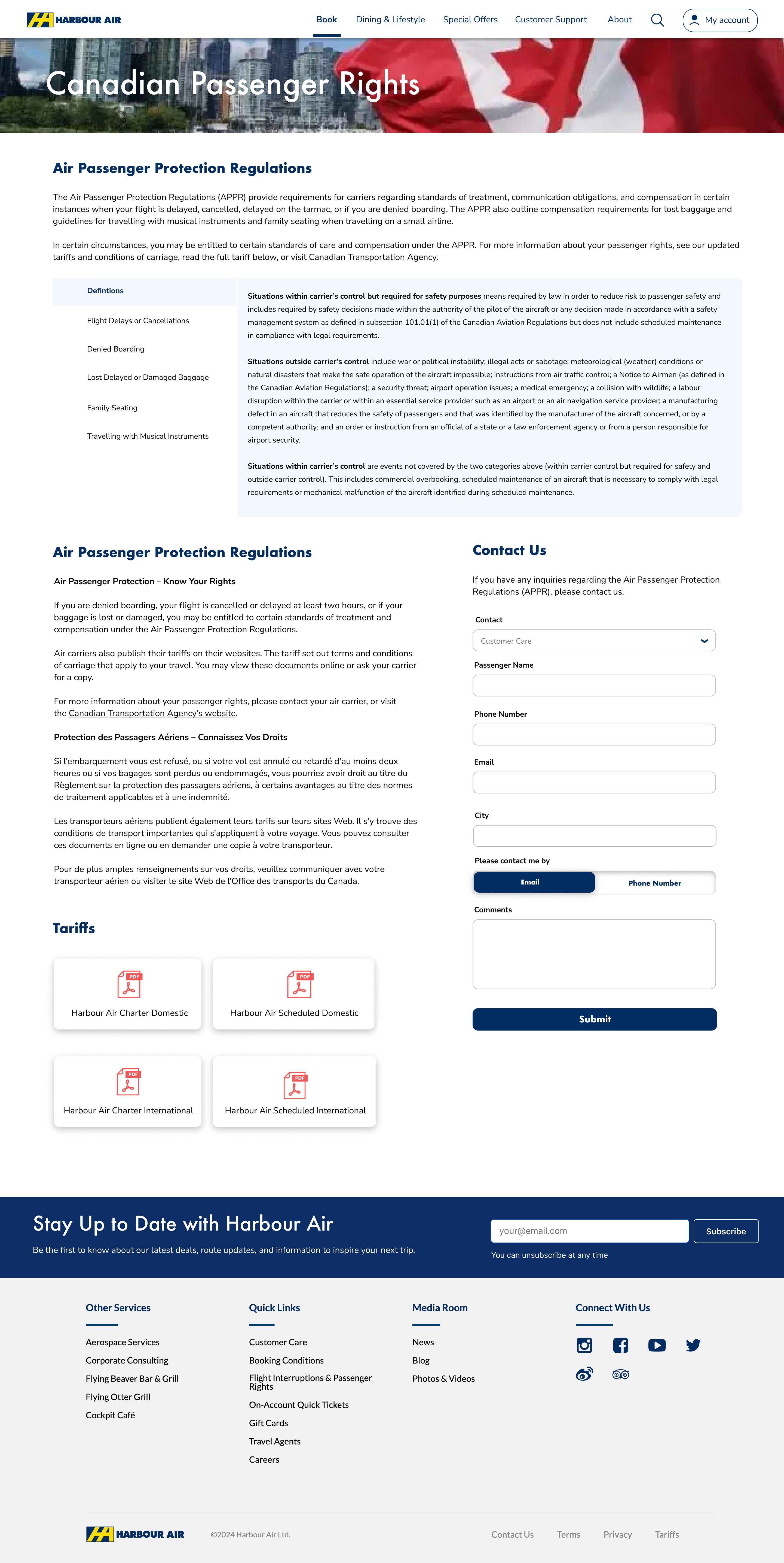
Passenger Rights
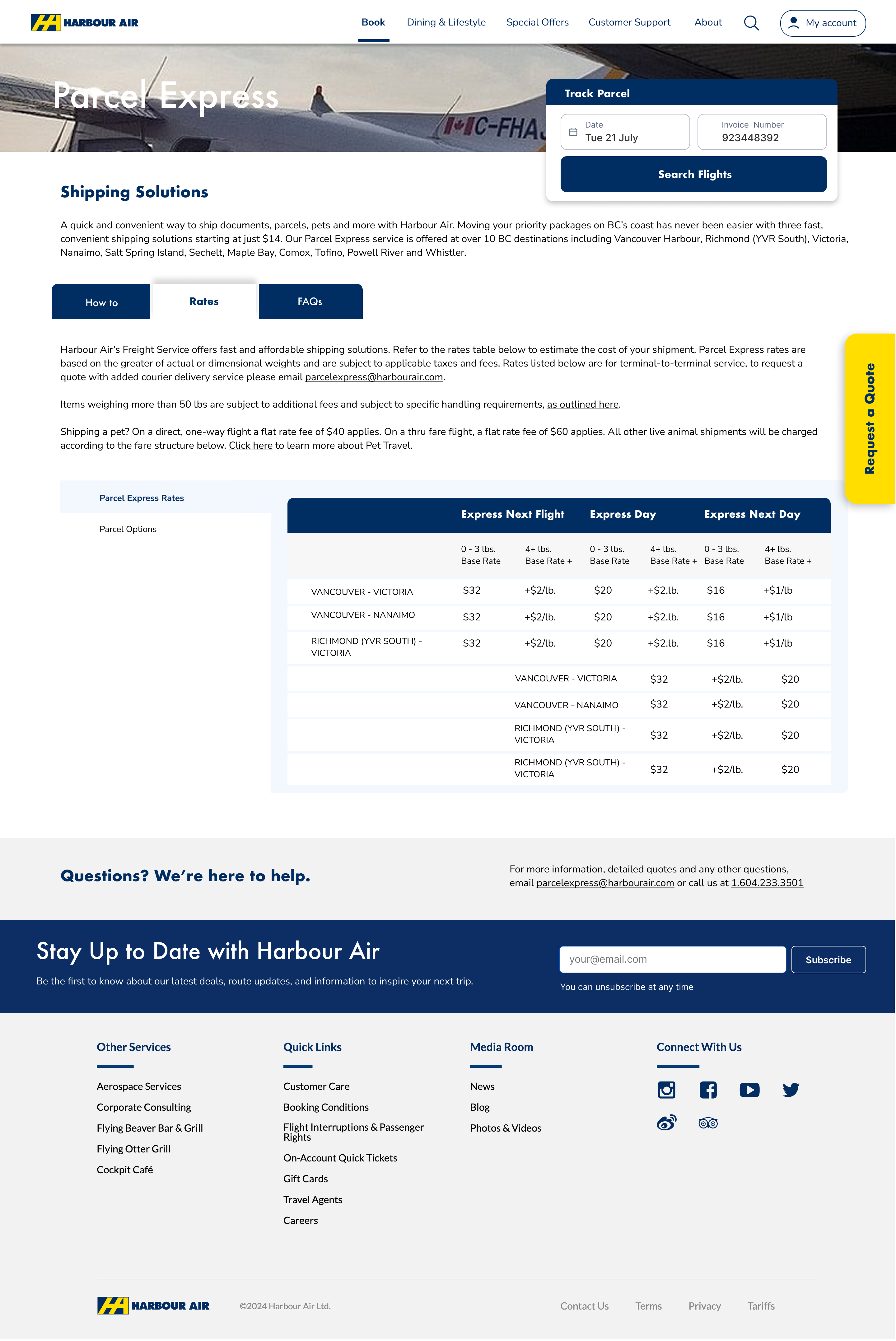
Parcels & Rates
08Outcome
every page
flow
with positive feedback
Impact
- Outdated cluttered website transformed into a clean, premium, conversion-focused experience
- Online ticket booking made significantly simpler - fewer steps, clearer fare types, less drop-off
- 15 destinations presented as an inspiring, browsable catalogue instead of an overwhelming flat list
- Tours and scheduled flights clearly separated - zero confusion between product types
- Design system established for consistent components, typography, and spacing across all pages
- Client satisfaction confirmed - work delivered, reviewed, and approved with enthusiastic feedback
Harbour Air taught me that great UX on a content-heavy website is fundamentally about information architecture before visual design. The old site wasn't hard to use because of bad aesthetics - it was overwhelming because nobody had organised the content with the user in mind. I learned to always start with a content audit and IA restructure before touching colours or components. When the structure is right, the visual design almost falls into place. That principle now drives every project I take on.
09Future Steps
-
01
Loyalty programme UX Harbour Air has no frequent flyer programme; designing one could significantly improve repeat booking rates and customer lifetime value.
-
02
Real-time flight status board Live departure experience on the website, reducing inbound support calls and improving the day-of-travel experience.
-
03
Personalisation Returning users see their frequent routes and preferred dates pre-filled on the booking widget - reducing time to conversion.
-
04
ePlane story Dedicated section for their electric floatplane sustainability initiative as it develops - turning environmental leadership into a brand asset.
-
05
Multi-language support Serving international tourists from Japanese, German, and French-speaking markets visiting British Columbia.